
- Backup
- Backup is the process of creating copies of files or drives to another file storage location to restore in the event of data loss. Backups typically are saved to external hard drives, thumb drives, or cloud storage options. Many companies, like Apple, offer cloud backup options for devices.
- Browser
- A Browser is a program that allows the user to view web pages on the internet or stored on the computer. Examples of web browsers are Google Chrome, Microsoft Edge, Mozilla Firefox, and Safari. Many modern web browsers are built with the same open source code base called Chromium.
- Database
- A database is a set of organized data. There are different ways for a database to be structured, hierarchical, network, relational, and object-oriented. Each type is dependent on the data provided and the best way for it to be organized and pulled when needed.
- Domain name
- A domain name is the readable name of the IP address for the web page the user is accessing. For example, Google is hosted at 172.253.122.101 so, the domain name would be google.com
- HTML (HyperText Markup Language)
- HTML is the code base of all webpages on the internet. Some websites may be primarily coded in another language like JavaScript but will always use HTML to display the other language. HTML has had many updates that has allowed for more advanced and secure web pages to be created.
- Hyperlink
- A Hyperlink is something a user can click or interact with to access another part of the current webpage, a different webpage, or a different file. A hyperlink can also be a URI (Uniform Resource Identifier) that can open a program on your computer.
- IP address
- An IP address is a unique number assigned to every device that is connected to the internet. This is what allows a device or server to be identified and connected to. It is also required for a domain name as an IP address is what a domain name points to.
- ISP (Internet Service Provider)
- An ISP is a company that allows access to the internet as they provide the physical infrastructure such as cables and servers that allow a router or modem to connect to the internet.
- Open source
- Open Source is code that the programmer or developer has made publicly available, free to use and change. Open source code typically requires attribution in the application that it has been used. Some developers will post their code on repositories like GitHub that allow for the ability to submit changes to the code or allow you to fork, or create your own version of the code using the existing open source code as the base.
- Password manager
- A password manager is an application that allows the secure storage of passwords on a device. The manager is typically locked with a pin number, password, or physical security key. Modern password managers also track compromised passwords and can create extremely complex passwords automatically.
- Phishing
- Phishing is the process of a malicious actor sending an email or text message posing as another person or organization. They may use a fake login page to trick the user into providing their username and password for a web page.
- Search engine
- A search engine is a web service that combs through the internet and indexes webpages to allow users to easily search for information on the internet. Popular search engines are Google, Bing, and DuckDuckGo.
- URL (Uniform Resource Locator)
- Similar to domain name however, URL is the complete address that allows you to access a webpage. A URL has to have a protocol and domain name. For example, https://google.com/ would be the URL for the domain name google.com.
- VPN (Virtual Private Network)
- A VPN is service that creates a secure connection to a server. A VPN is typically encrypted so that the data you are sending between the server and device is not readable to outside parties. Some VPNs only allow you to connect to intranet services or allow you to hide your web traffic.
- Web hosting
- Web hosting is the process of a web server hosting the files for a web page. Web hosting provides the IP addresses and storage space for websites to be stored and easily accessible 24/7.
State of the Union
The Atlantic in 2015 wrote a series of posts about The Language of the State of the Union, both the literal words and the places that were referenced. Using modern Bookworm they were able to create webpages that, using the analyzed data of each State of the Union address, showed the most used words and when they were said. Bookworm is a tool “that visualizes Bookworm is a simple and powerful way “to visualize trends in repositories of digitized texts.” and since the link in the Atlantic article is broken we can use the Wayback Machine to go back and look at the Bookworm tool and the other things they have done with the tool.
The Language of the State of the Union
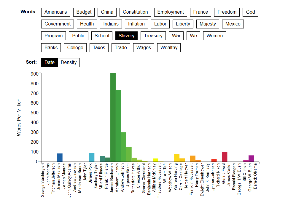
The Language of the State of the Union article displayed their data in a bar graph with keywords that the authors chose to show. In the screenshot above I chose the word “slavery” as an example which has a concentration with James Buchannan and Abraham Lincoln using the word the most, respectively. Which makes sense as these were the president before (Buchannan) and during (Lincoln) the Civil War, a war over Slavery.
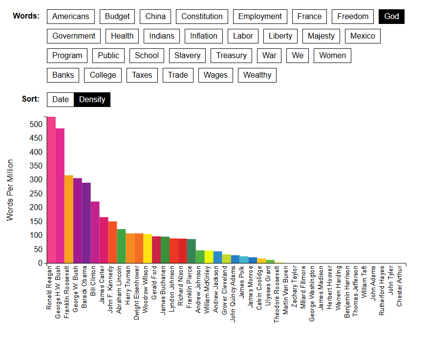
You can also visualize the data in order of who used the word the most to least. Using the word “God” you can see that most of the early presidents did not use the word, presumably to keep up with the idea of the separation of Church and State. The president who used it the most was president Ronald Reagan who built a base of Evangelical Christians.
The State of the Union in Context
Benjamin Schmidt, one of the authors of the articles, created a page on his website titles The State of the Union in Context. On this site you are able to click on the different words from a transcript of different addresses and see the usage of that word. However, possibly due to my browser settings or due to modern browser technologies this tool does not show me the graph the way it is supposed to.
The Mapping of the State of the Union
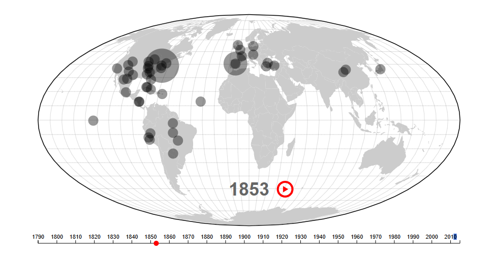
Like the Language of the State of the Union they took each speech or letter and for each year whenever a place is mentioned it is put onto a map of the world. The larger the circle, the more the place was mentioned! One downside to this version is they did not include who was the president for that year. So, if you are not an expert who knows the chronological order of the presidency than you will probably have to look up who was president in, for example, 1853.
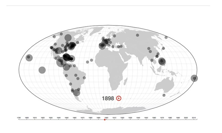
In the article they use 1898 as an example and the context as to why there is so much talk about so many different places around the globe is the War with Spain in 1989. The United States gained the territories of the Philippines, Puerto Rico, and Guam. Cuba was also a part of the war where we helped them gain independence from Spain, which is why it is talked about so much as well.
The Authors
The authors Benjamin Schmidt and Mitch Fraas are both historians that specialize in digital technologies. Benjamin has “worked with and led digital humanities groups deploying new approaches to thinking about the past through data analysis and data visualization.” and Mitch is “currently a principal investigator on a multi-institutional project to digitize over 500 manuscripts from the Islamicate world held in Philadelphia and New York libraries.” Making them a great team of authors to help create a set of articles regarding the digital analysis of all the State of the Union addresses.
Test
This is a test post